A production-ready design system bridging design and engineering.
Company
Valmont Industries
Platform
Web App · Tablet
Role
Product Designer — End-to-End
Components
15+ Categories
Tools
01 / Overview
A comprehensive, production-ready design system built on Tailwind CSS conventions — delivering full component coverage, state documentation, and developer-handoff annotations across Valmont's Valley product suite.
Every token maps directly to a Tailwind class name. Every interactive component documents all six states. Every annotation was built for developer clarity — not designer satisfaction.
Components
15+ Categories
State Coverage
6 States Each
Token Alignment
Tailwind CSS
02 / Challenge
Without a system, every screen is a new decision.
Valmont's Valley product suite spans enterprise web applications and field tablet tools — multiple surfaces, multiple teams, multiple engineering stacks. Without a unified design language, the same button appeared in four different sizes across six different screens.
Same components, different sizes and colours across screens built by different teams.
Developers re-interpreted designs rather than implementing a named spec — introducing drift on every sprint.
Components existed in one state — the happy path. Hover, disabled, error, and validation were built ad hoc.
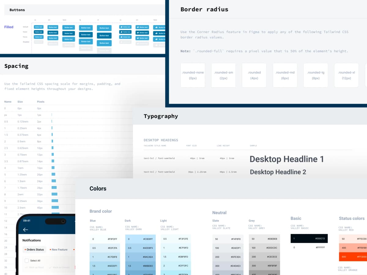
Tokens first. Components second.
Typography Scale
Color Tokens
Brand
Status
Every component. Every state. Every size.
A comprehensive library of production-ready UI components, each documented with full state coverage, size variants, and annotation for developer handoff.

Inputs
Text, textarea, suffix/prefix, labeled. 4 sizes × 6 states.

Dropdown
Simple, multiselect, grouped, search with inline add.

Buttons
Primary, secondary, ghost, destructive. Icon-only buttons with tooltips.

Selectors
Toggle, Checkbox, Radio button and Radio group. All 4 states.

Tabs
Desktop (MD/LG) and Mobile variants. Active: blue underline.

Dialog / Modal
Scrollable body with fixed header + footer. Max height 95vh.
The system follows five non-negotiables.
Tailwind Alignment
All tokens map directly to Tailwind class names. The language of design matches the language of code — no translation layer.
State Completeness
Every interactive component covers Default, Hover, Active, Focus, Disabled, and Validation. No state is left to developer interpretation.
Accessibility First
Icon-only buttons always paired with tooltips. Destructive actions use red. Minimum 44pt touch targets on tablet surfaces.
Responsive Awareness
Desktop and Mobile variants documented separately wherever behaviour differs — not assumed to be the same at a smaller size.
Figma-Ready
All components use dashed purple annotation borders, full auto-layout, named effect styles and color styles. Dev Mode ready on delivery.
06 / Outcome
“Standardized 200+ UI components into a master design system — increasing designer-to-developer handoff speed by 25% across the Valley product suite.”
Single Source of Truth
One Figma file serves as the definitive component reference for all Valley products — web and tablet — eliminating per-project design drift.
25% Faster Handoffs
Named components, annotated interactions, and Tailwind-aligned tokens mean developers implement rather than interpret.
Full State Coverage
Every component ships with all 6 interaction states. Edge cases, validation, disabled, and error flows are designed before a line of code is written.
Field-Tested
The same token set that powers enterprise web dashboards is deployed directly in the Field Layout Tool iPad app — one system, two surfaces.
NEXT PROJECT